Classifications of typefaces
Different systematic approaches exist for classification of typefaces. A historic approach seems most reasonable, even though modern designs may be difficult to assort. But there are disputable cases in every systematics.- The Romans used large (capital) letters similar to those engraved in stone.
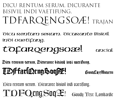
Antique
- Mediaeval minuscule typeface, consisting of small letters only.
Uncial
- Developed from Italian office scripts,
contain many edges and branches in their forms.
In printing, the typeface of Gutenberg was widespread.
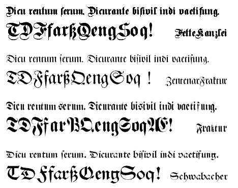
Broken typefaces / Blackletter
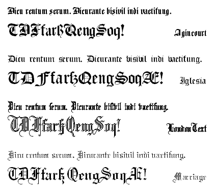
-
From the black letters, two groups of broken typefaces developed, Old English (right) and Old German (below) with more curly forms.
- The resumption of antique (e.g. Roman) basic letter forms and their
combination with suitable small letters.
Serif styles (Antiqua)
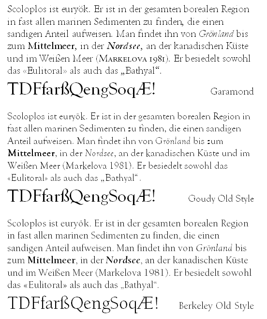
- The basic forms remind of the informal forms of handwritten letters,
e.g. round forms (like small "o") are often slightly slanted leftwards.
Corresponding to the printing techniques of the time,
serifs are attached with a flat curve and have wide ends.
Well-known exponents:
- Garamond with many variants and look-alikes,
- Palatino,
- Goudy Old Style,
- Century Old Style,
- Berkeley Old Style.
Garamond is exceptionally popular. Its modest aesthetics makes it universally useful while providing optimal legibility. (With the exception of ITC-Garamond which appears rather thick.)
Old style (renaissance)
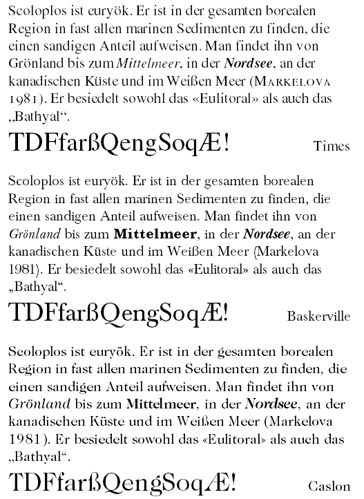
- Serious symmetric forms.
Serifs are attached with circular roundings and end in a thin spike.
Well-known exponents:
- Times,
- Baskerville,
- Caslon.
Transitional (baroque)
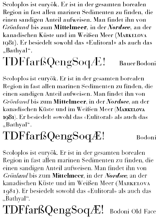
- Striking contrast between vertical stems of uniform width
and very thin horizontal lines.
Serifs are very fine too and are usually attached at a right angle,
corresponding to the copper gravure printing technique of the time.
Best-known exponent:
- Bodoni, increasingly popular recently; with many variants.
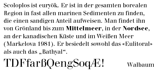 Another succinct exponent:
- Walbaum
- Bodoni, increasingly popular recently; with many variants.
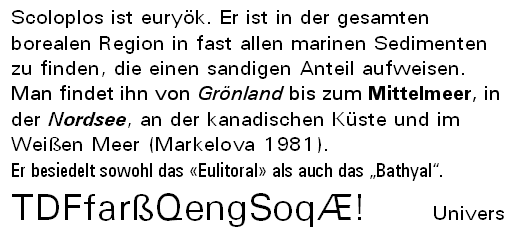
Modern (classicism)
- By the end of the 19th century, a more technical conception of
typefaces omitted the traditional serifs and developed more
schematic, stylised letter forms.
This led to typefaces like
- Helvetica (no picture, the typeface without properties is well-known)
- and the more or less bearable Univers.
Sans serif styles (serif-less Antiqua)
Grotesque
- This notion characterises sans-serif typefaces that
revert to the traditional letter forms and maintain variations of their
line widths. This way, typefaces became again more convenient for
human reading habits.
Exponents to be mentioned:
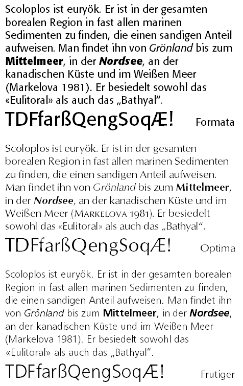
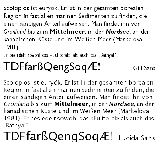
- Gill Sans,
- Lucida Sans,
- the famous Optima, whose fine properties are only revealed at good printing quality,
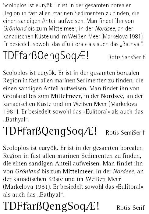
- the modern Rotis SansSerif,
- Frutiger,
- the presentation typeface Formata,
- the striking AntiqueOlive.
Humanist
- In consequence of the technical typeface conception, typefaces
were developed whose forms are based on simple geometric forms.
Exponents are
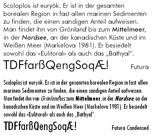
- AvantGarde, consisting only of circles and straight lines,
- but also the quite appealing Futura.
Geometric
- Uniformly wide, striking serifs are the characteristic design
property of these typefaces.
Exponents:
- Glypha
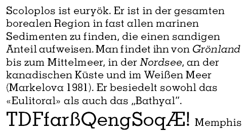
- Memphis
- Rockwell
- American Typewriter
Slab Serif
- Just like in other areas of style (architecture, music), typeface variety has become more creative and diverse.
Contemporary Antiqua typefaces
- Some modern designs like Palatino and Times can clearly be
assigned to historic styles (Old style and Transitional, respectively).
For others a category is less obvious.
The Times New Roman (Times) is a transitional (baroque) design from about 1930. It had the requirement that much text should fit on a page of the Times newspaper. That partly explains its moderate legibility.
Designs resembling traditional styles
- Some typeface designers created groups of typeface families
that correspond to different basic kinds but maintain compatible
style:
- Stone by Sumner Stone with a serif, a sans serif and an informal typeface;
- Rotis by Otl Aicher with a serif, a sans serif and two intermediate typefaces.
Typeface families
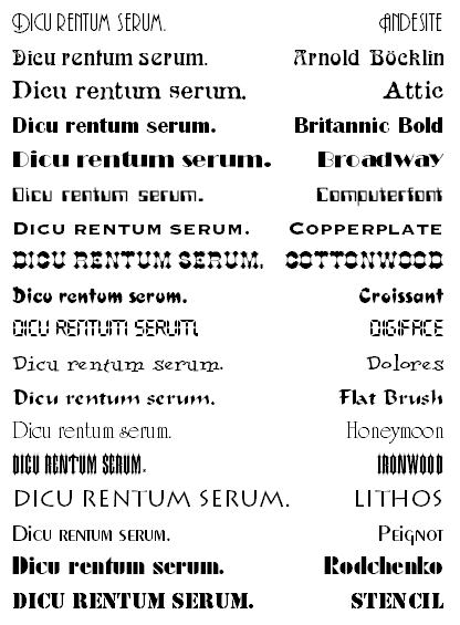
In addition to modern Antiqua designs, there are a large number of special typefaces that can be used for specific purposes:
-
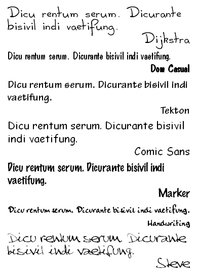
- Handwritten Antiqua, looks like hand-written script with Antiqua letter forms
- Handwritten Antiqua, looks like hand-written script with Antiqua letter forms
Handwriting
-
- imitated of scanned hand scripts
- imitated of scanned hand scripts
-
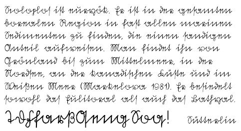
- the old German hand script S�tterlin
-
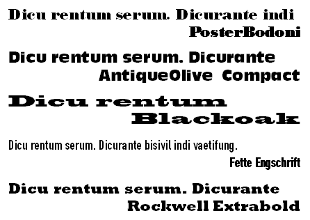
- Headline and Poster typefaces used as an eye-catcher
- Headline and Poster typefaces used as an eye-catcher
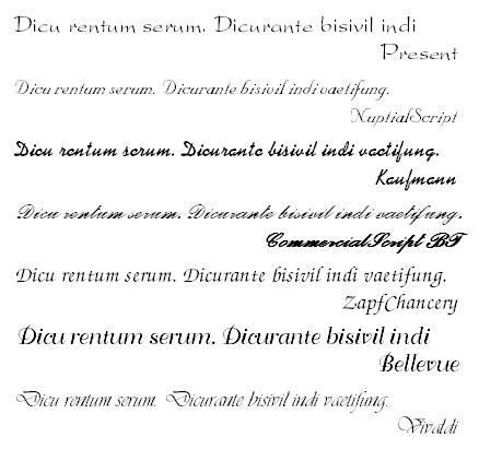
Design typefaces
-
- Decorative typefaces
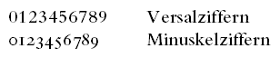
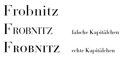
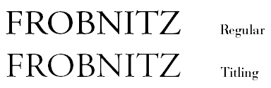
 Among the special typeface variants there are small capitals (small caps)
and old style figures:
Among the special typeface variants there are small capitals (small caps)
and old style figures:
-
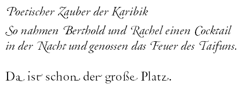
- Swash letters: alternative letters with attached ornaments. They were formerly used for column alignment but can also be used to beautify a text (more suitable for poetic text)
-
- Expert variants with special letters and letter combinations that are not covered by the normal letter set, e.g. small superscript letters as used for certain abbreviations in French and Spanish etc.

- Expert variants with special letters and letter combinations that are not covered by the normal letter set, e.g. small superscript letters as used for certain abbreviations in French and Spanish etc.
Book recommendations
Well, actually I have currently only one recommendation that matches the introductory intention of this presentation, and that's in German.
Frequently asked questions
can be found in the FAQ (mostly in German).
Links
to other good Internet pages about typefaces.
Feedback and further questions
Click here to send e-mail to
Thomas Wolff.